Dinkie
Dinkie
A vibrant onepager for the new kid in town, Dinkie!
A fun and healthy candy.
A vibrant onepager for the new kid in town, Dinkie! A fun and healthy candy.
Client
Dinkie
Team
Multidisciplinary
Service
Research
Visual design
Service
Research
Visual design
*Video isn't compatible with Safari, please use Chrome or another browser.
*Video isn't compatible with Safari, please use Chrome or another browser.
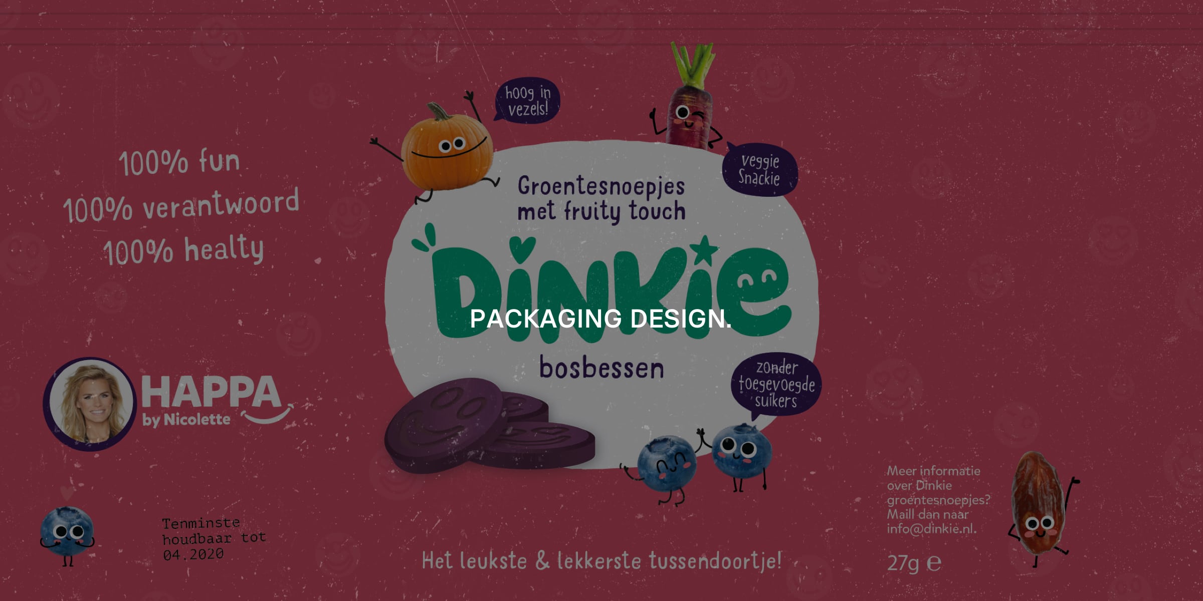
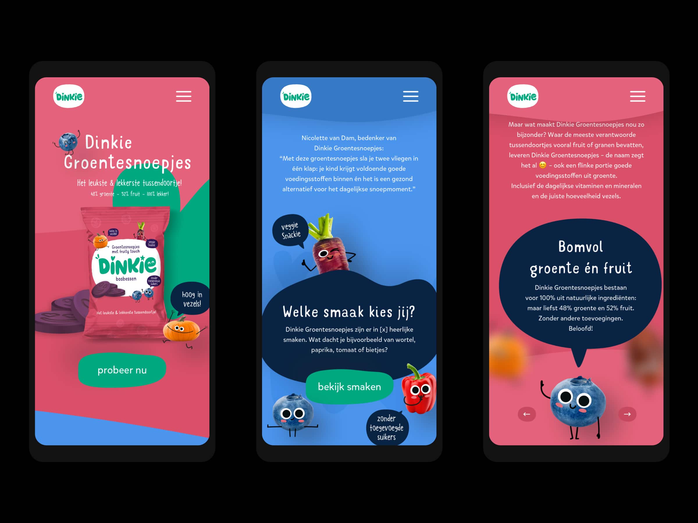
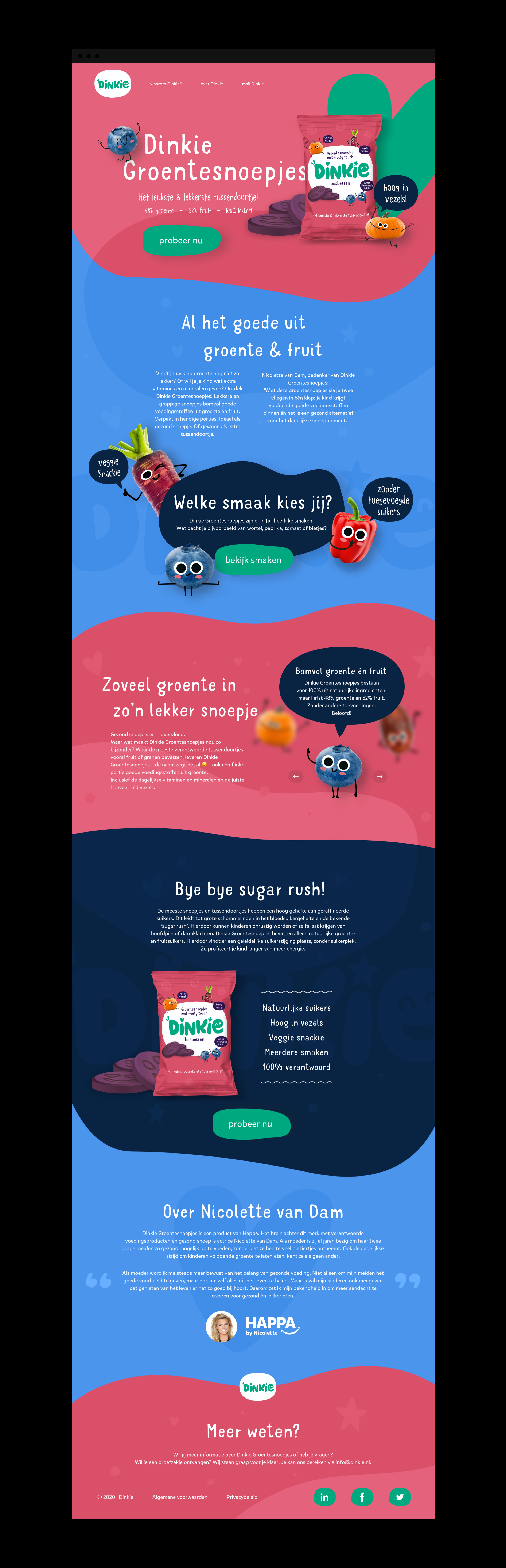
The assignment for the Dinkie pitch was to make a one-pager. The main functions of the one-pager was to inform people why Dinkie is unique and to encourage people to purchase this new healthy candy. The design of the one-pager had to be colorful, user-friendly, fun and was aimed at children.
The assignment for the Dinkie pitch was to make a one-pager. The main functions of the one-pager was to inform people why Dinkie is unique and to encourage people to purchase this new healthy candy. The design of the one-pager had to be colorful, user-friendly, fun and was aimed at children.
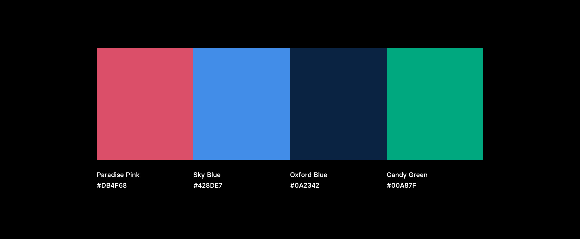
For the identity of the product and one-pager, only the pink colour, packaging design and the font pairings were set. The other three colors were paired by me. The reason why I chose the Sky Blue and Candy Green was to stick to the vibrant and fun appearance. The Oxford Blue is used to create a contrast that brings the design in balance against the strong vibrant colors.
For the identity of the product and one-pager, only the pink colour, packaging design and the font pairings were set. The other three colors were paired by me. The reason why I chose the Sky Blue and Candy Green was to stick to the vibrant and fun appearance. The Oxford Blue is used to create a contrast that brings the design in balance against the strong vibrant colors.
The biggest challenge for me was to make a design that was colorful and aimed at children. I am used to design things that looks clean and simple. To take this challenge on I did some research to similar brands and made my own moodboard to use as a guide reference. This helped me to translate the requirements from Dinkie to an actual one-pager.
The biggest challenge for me was to make a design that was colorful and aimed at children. I am used to design things that looks clean and simple. To take this challenge on I did some research to similar brands and made my own moodboard to use as a guide reference. This helped me to translate the requirements from Dinkie to an actual one-pager.
Working on this project was fun, but unfortunately we did not win the pitch. I learned that I still have a long way to go to get familiar with things that are unknown to me, like designing for kids. The upside of this project was that I was able to explore in this area and gain some experience.
Working on this project was fun, but unfortunately we did not win the pitch. I learned that I still have a long way to go to get familiar with things that are unknown to me, like designing for kids. The upside of this project was that I was able to explore in this area and gain some experience.
All Rights Reserved 2020 ©
Amrish Jagroe